Mastering Mood: How to Use Color and Light in Editorial Photography
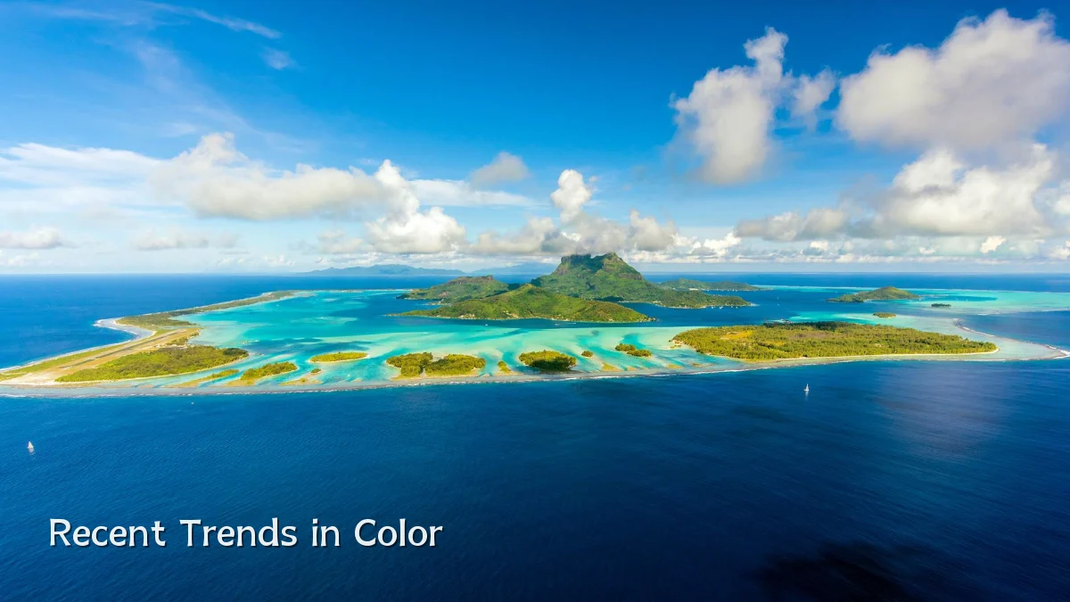
Recent Trends in Color and Light
Editorial photography has seen a noticeable shift toward deliberate, mood-driven color palettes and lighting strategies. In the past few years, editors and photographers have moved away from evenly lit, high-key images in favor of compositions that rely on shadow, temperature, and chromatic contrast. Natural and practical light sources—window light, candlelight, or street lamps—are frequently used to create a sense of intimacy or tension. Meanwhile, post-production color grading has become more nuanced, with split-toning and selective desaturation used to reinforce narrative tone rather than simply correct white balance.
- Muted palettes (desaturated greens, ochres, deep blues) dominate lifestyle and fashion editorials.
- Mixed lighting – combining tungsten and daylight – is increasingly common to evoke a documentary feel.
- Color blocking continues to appear, especially in branding and concept editorials.
Background: Why Mood Matters
Color and light have always been foundational to visual storytelling, but their role in editorial photography has sharpened as audiences become more visually literate. Publications and brands now demand images that communicate a specific emotional arc before the viewer reads a single caption. Warm tones and soft diffused light typically signal comfort or nostalgia; cool, high-contrast lighting suggests tension or detachment. This understanding is not new, but its application is more intentional in an era where editorial images compete for attention in fast-scrolling feeds.
“A shift in color temperature can change the entire reading of a story. It is not about what looks pretty—it is about what the story needs.” — common sentiment among photo editors (paraphrase, no direct quote).
User Concerns and Practical Challenges
Photographers and art directors face several recurring concerns when trying to master mood through color and light:
- Consistency across a series: Maintaining a unified mood while shooting in varied lighting conditions or locations.
- Over-reliance on post-production: Heavy color grading can backfire if the original exposure and white balance are not captured thoughtfully.
- Client expectations: Some clients request a specific “vibe” without understanding how lighting limitations affect feasibility.
- Budget constraints: Professional lighting gear and locations with controlled ambient light are often out of reach for smaller assignments.
Photographers typically address these by scouting locations with existing light structures (large windows, reflective surfaces) and by creating a simple lighting diagram before the shoot. In post, they rely on LUTs and preset adjustments that can be fine-tuned per image, rather than applying a one-size-fits-all filter.
Likely Impact on the Industry
As mood-driven editorial imagery becomes a baseline expectation, several changes are emerging:
- Production planning now includes a “lighting and color brief” alongside the traditional style or mood board.
- Education for emerging photographers increasingly emphasizes color theory and practical lighting techniques over gear specs.
- Stock and licensing markets are shifting: images with distinct mood profiles (e.g., “melancholy,” “euphoric”) command higher search relevancy and licensing rates.
- Portfolio expectations have evolved: editors now look for demonstrable control of light and color rather than a wide variety of subject matter.
What to Watch Next
Several developments are worth monitoring in the near term:
- AI-assisted color grading – tools that automatically suggest mood-based palettes from a photograph could reduce manual work but may also homogenize styles.
- In-camera color profiles – camera manufacturers are introducing more customizable LUTs and color science settings that allow photographers to commit to a mood during the shoot rather than in post.
- Client education – more agencies are creating internal guidelines that help non-creative stakeholders understand the language of light and color, minimizing last-minute revisions.
- Hybrid editorial-commercial work – a growing niche where editorial mood techniques are used in commercial advertising to differentiate brand campaigns from standard product shots.
Ultimately, the mastery of mood through color and light is no longer an artistic luxury in editorial photography—it is a functional skill that dictates how a story is perceived and remembered. Staying attuned to these evolving techniques will remain essential for photographers and editors alike.